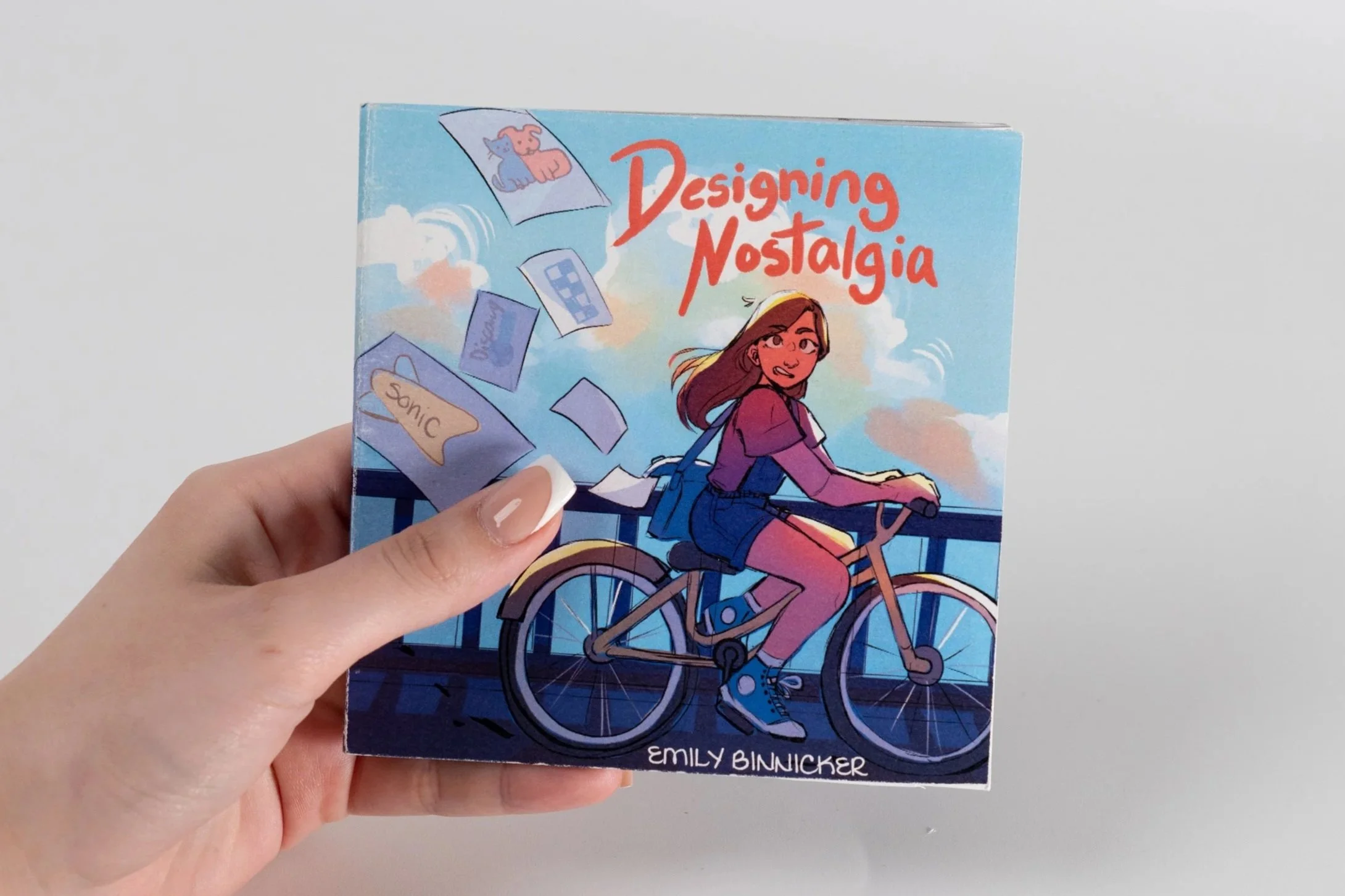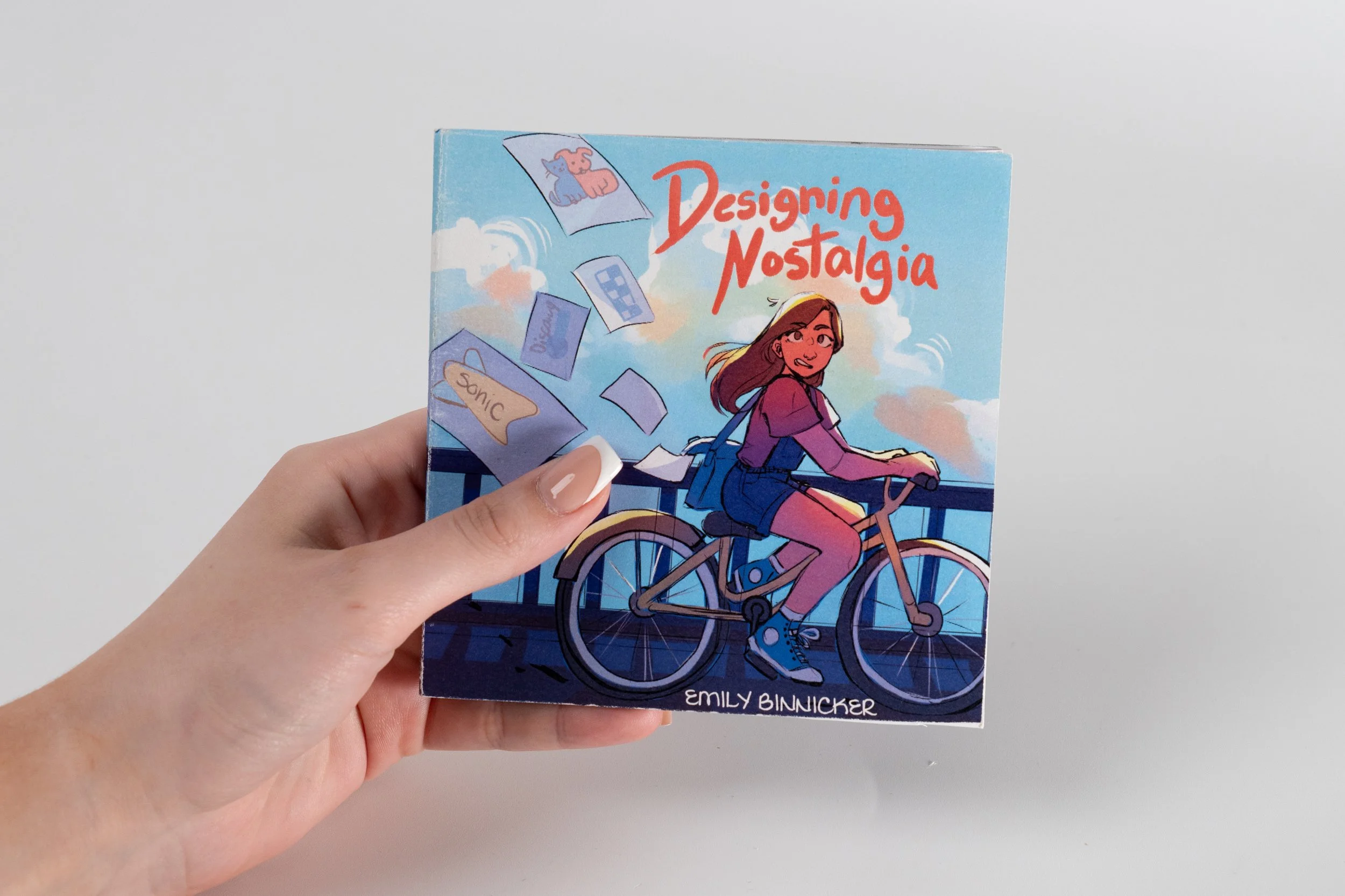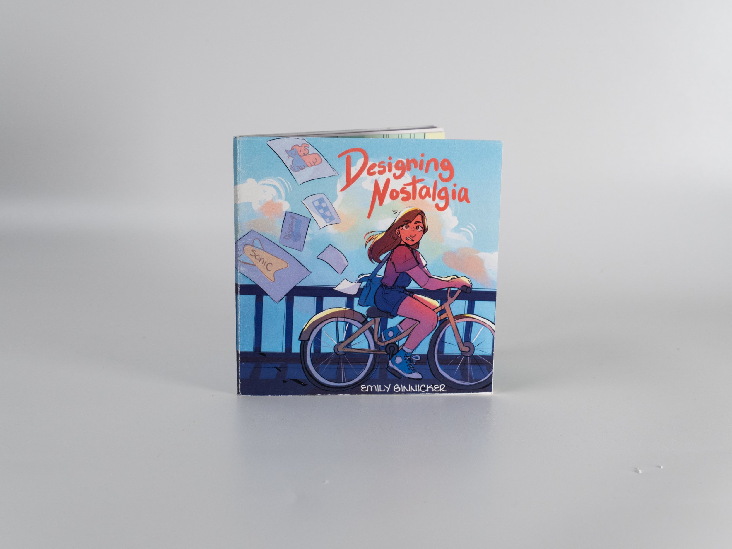
Designing Nostalgia
Project Brief
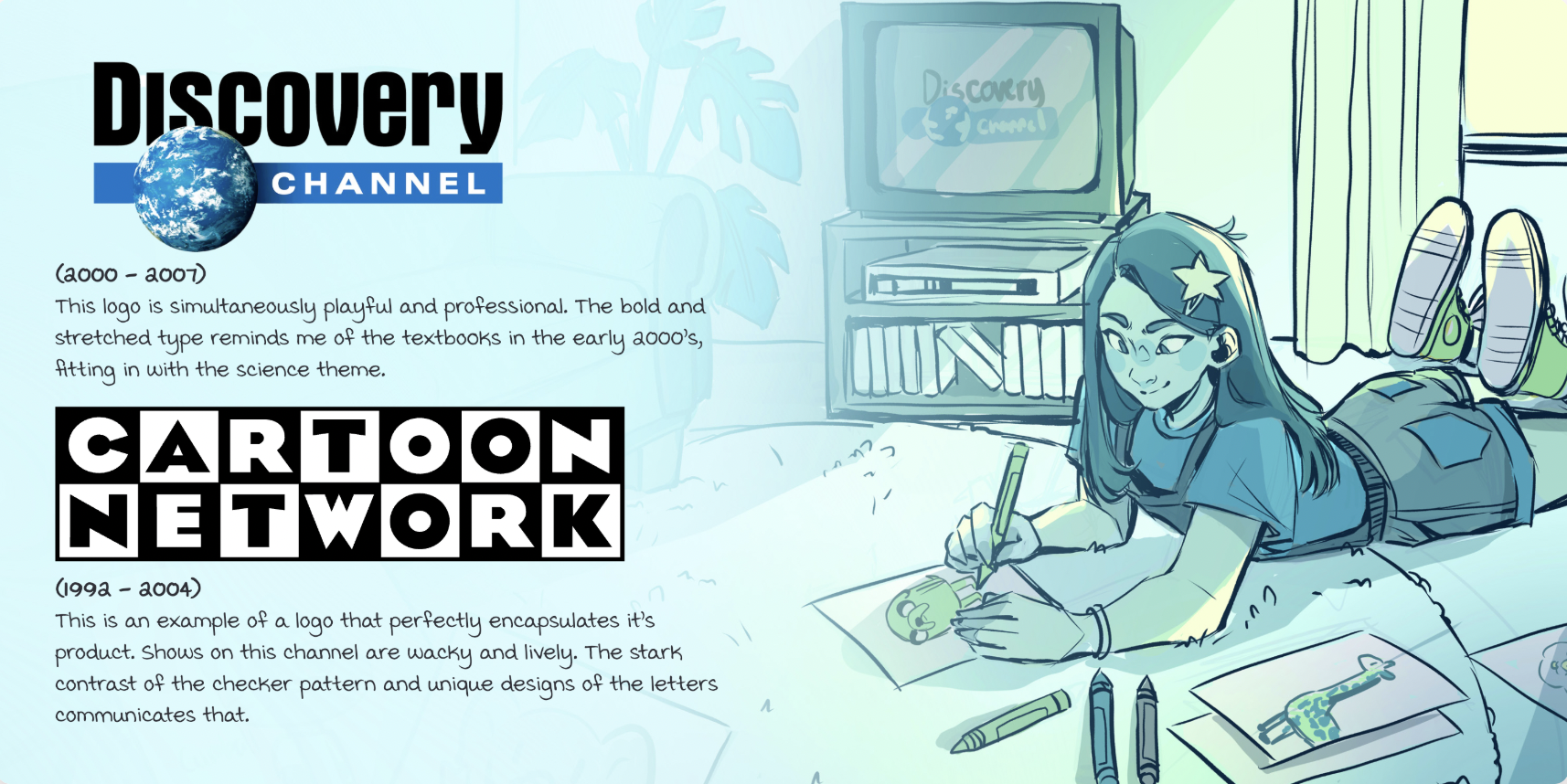
As an artist and designer I have noticed a new style has emerged in the last few years in branding. The two most important factors are simplicity and recognition. While these factors sound good on paper, I have found that many of the designs lose sight of what the soul of their brand is and the personality that came from it.
These new designs almost felt like they reflected where I was at in life, they were growing up, trying to be more refined. I found myself missing the feeling I got from the old designs and feeling cold towards the new ones. What is that feeling? How does a logo make you miss your childhood?
This project provides research into the evolution of logo design but told through through the lens of a consumer.
Process
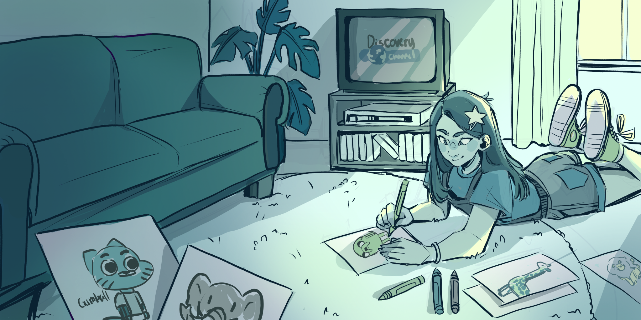
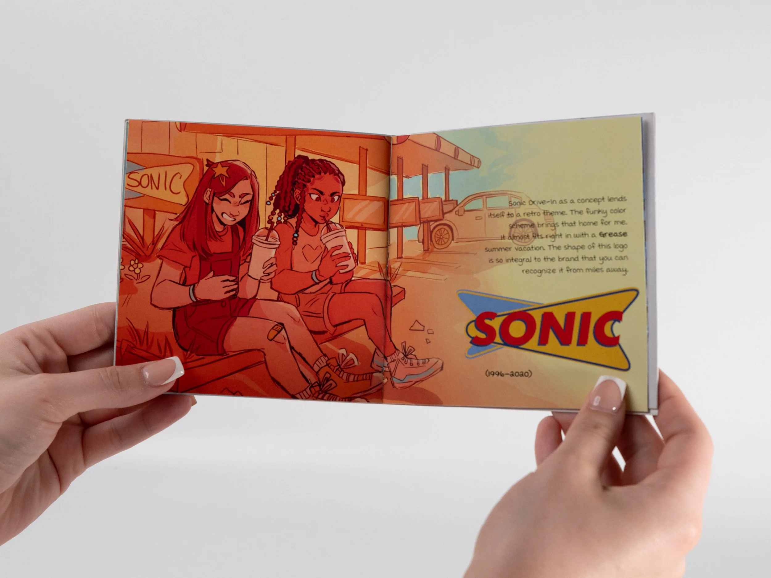
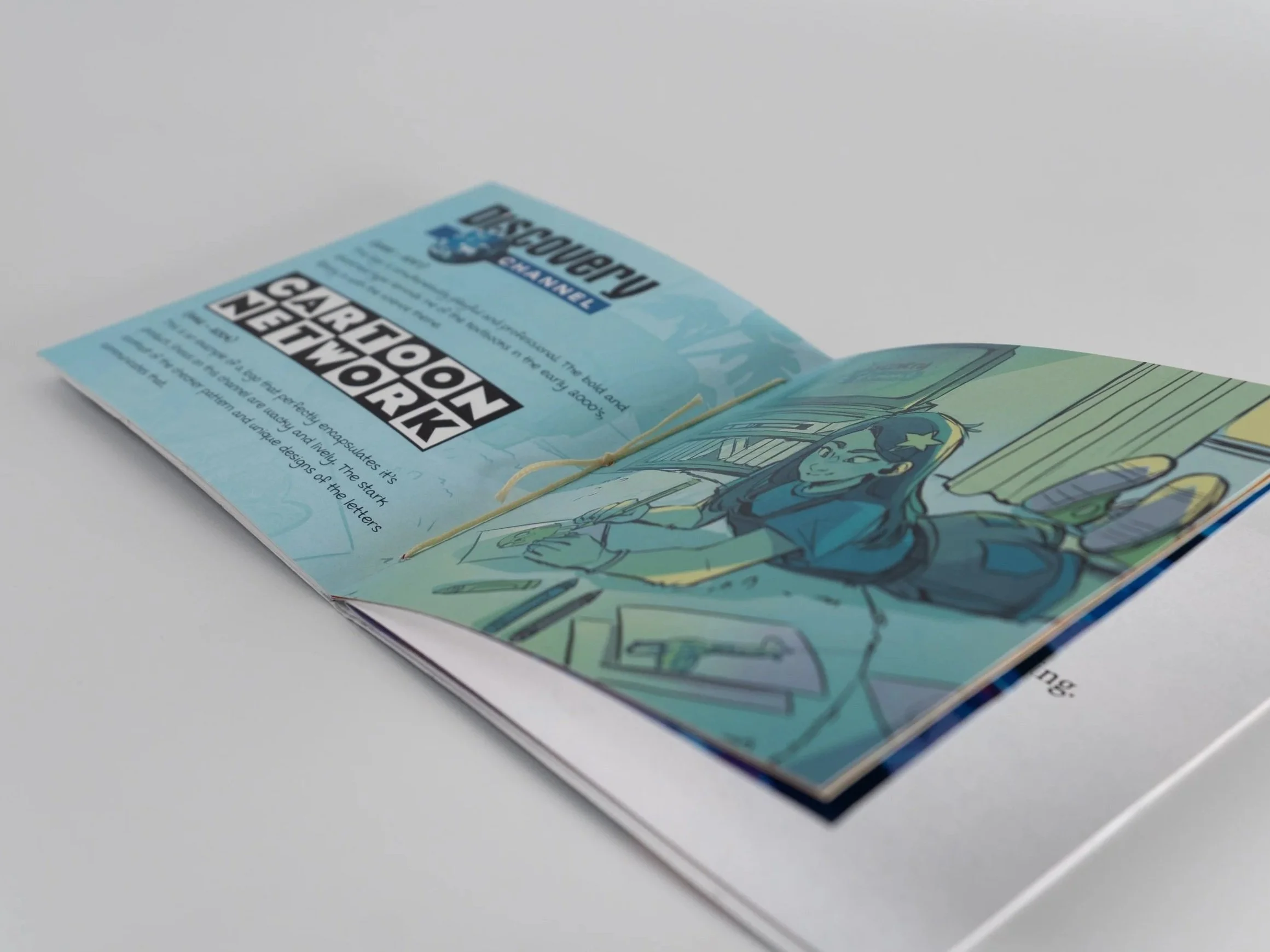
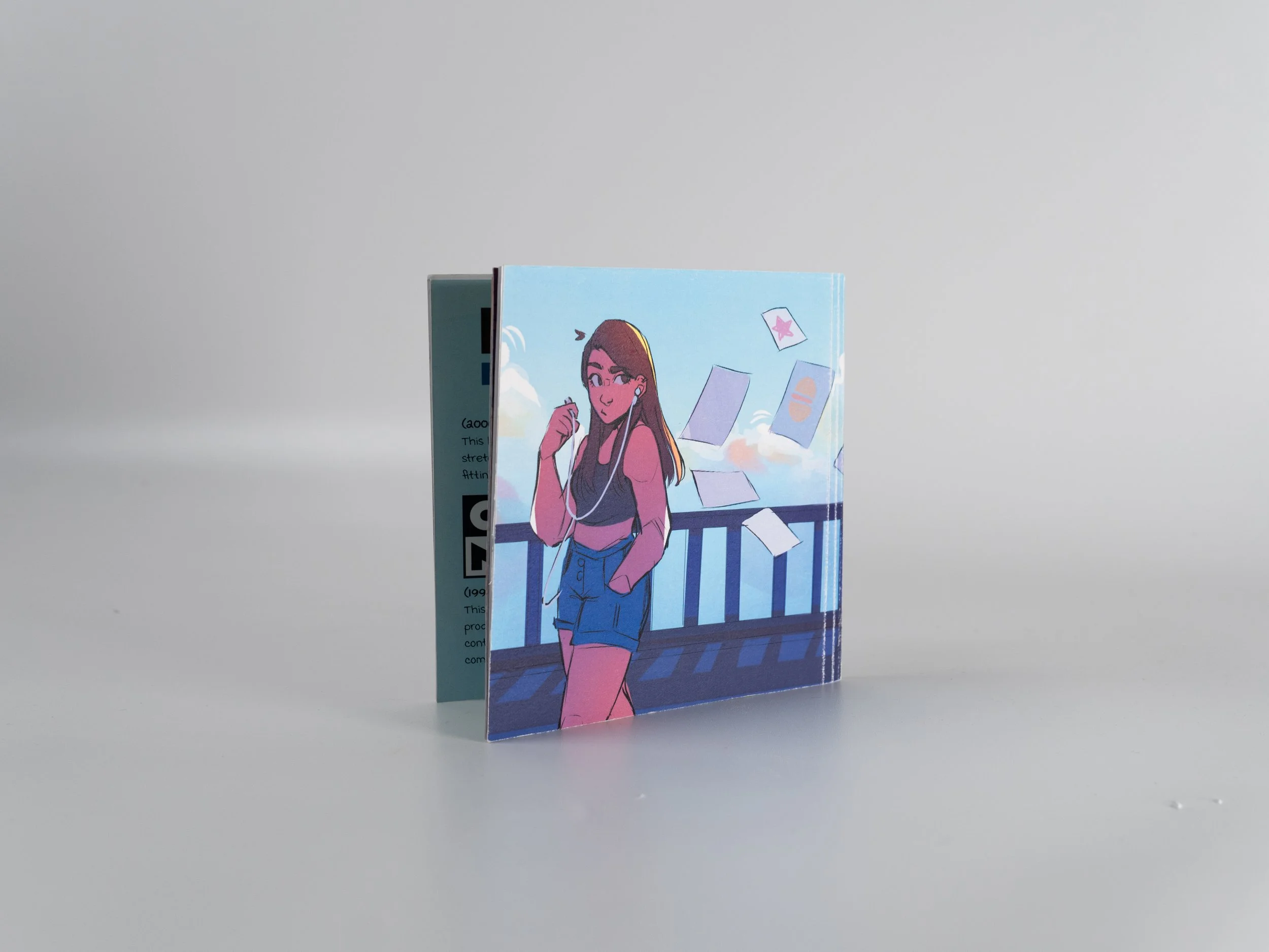
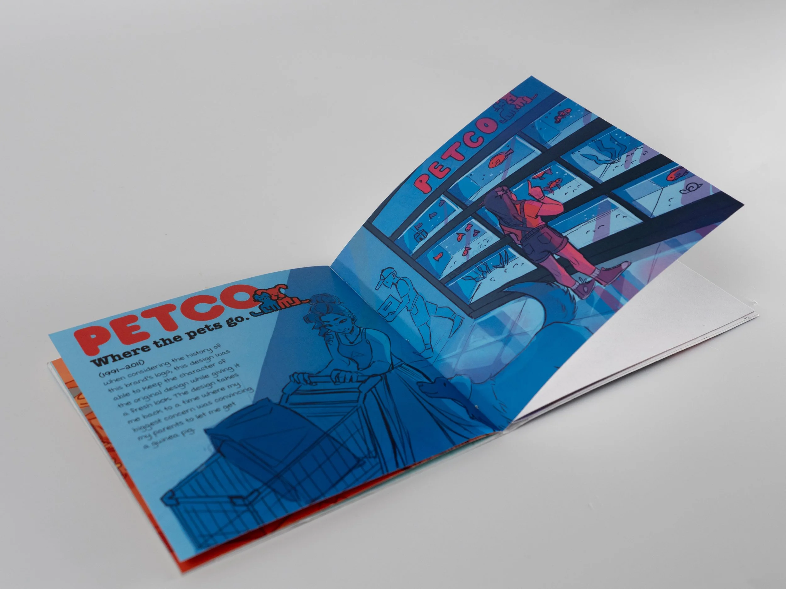
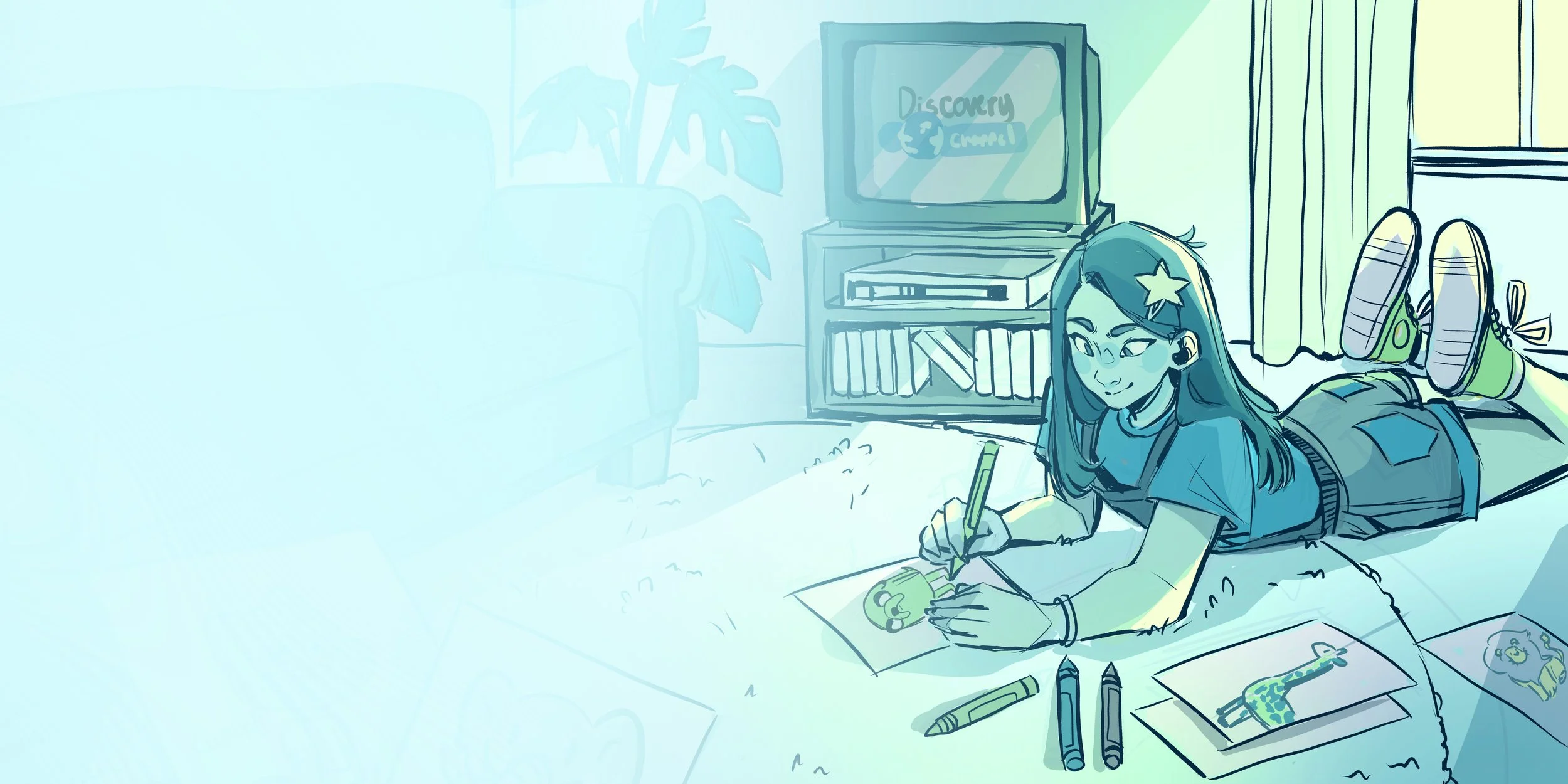
The zine is structured like a children’s storybook, beginning with “once upon a time”. The beginning of the zine features illustrations displaying how I interacted with that logo in my childhood.
The colors of these pages are bright and vibrant and the paper it is printed on is textured and soft. Halfway through the zine, the story skips time to the present day. These pages display how I interact with these new logos. The colors are much more realistic, maybe even a bit desaturated. The paper it is printed on is standard and slim.