Project goals
The goal of this project was to build onto the current brand that people have grown accustomed to while reworking what is not functional. The original brand has a great sense of energy but lacks some overall cohesion in their visual identity. By focusing on their most iconic products (that being their ice cream) I aimed to create a new look that is memorable and fits the tone of the company.
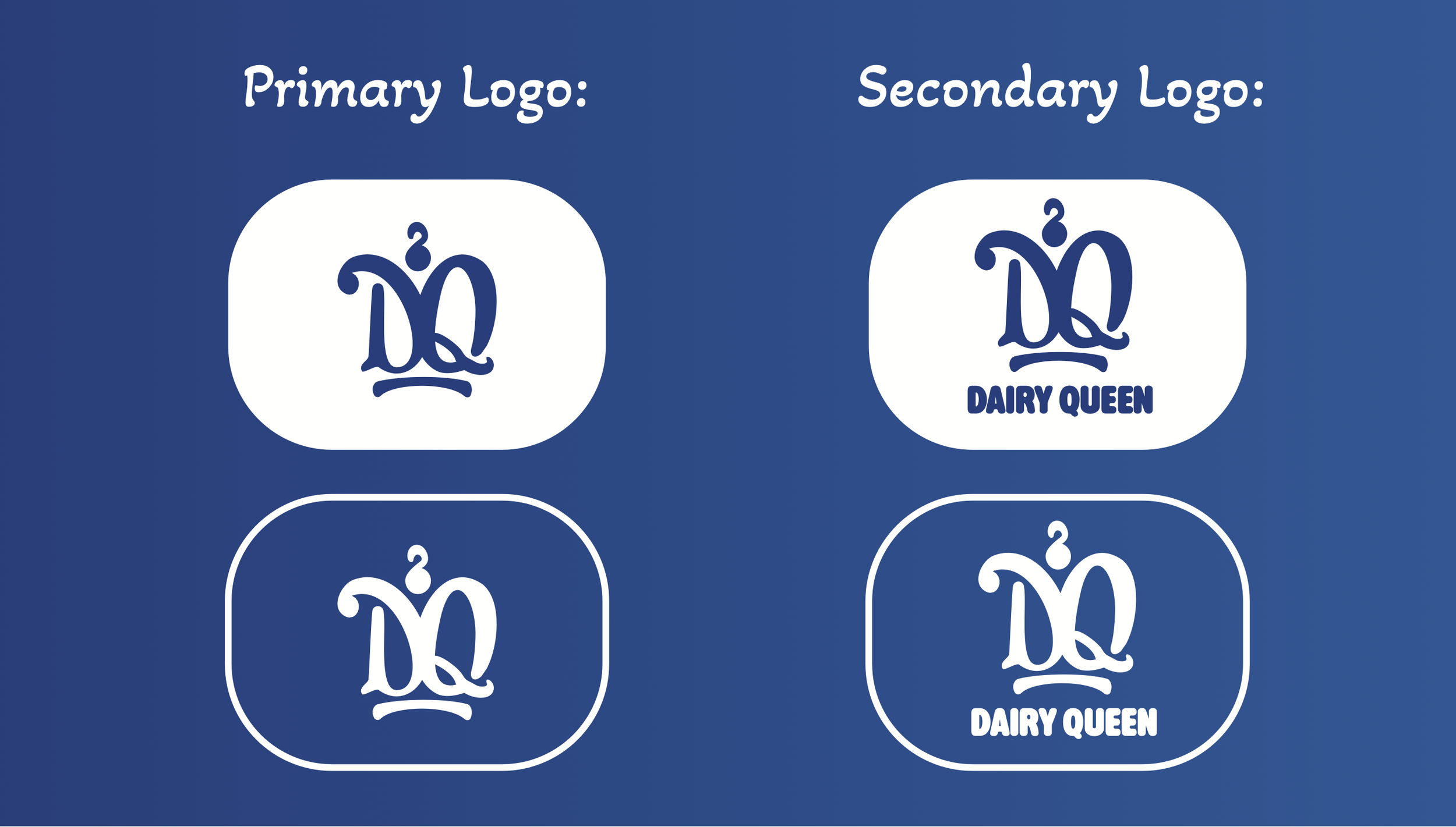
Redesign
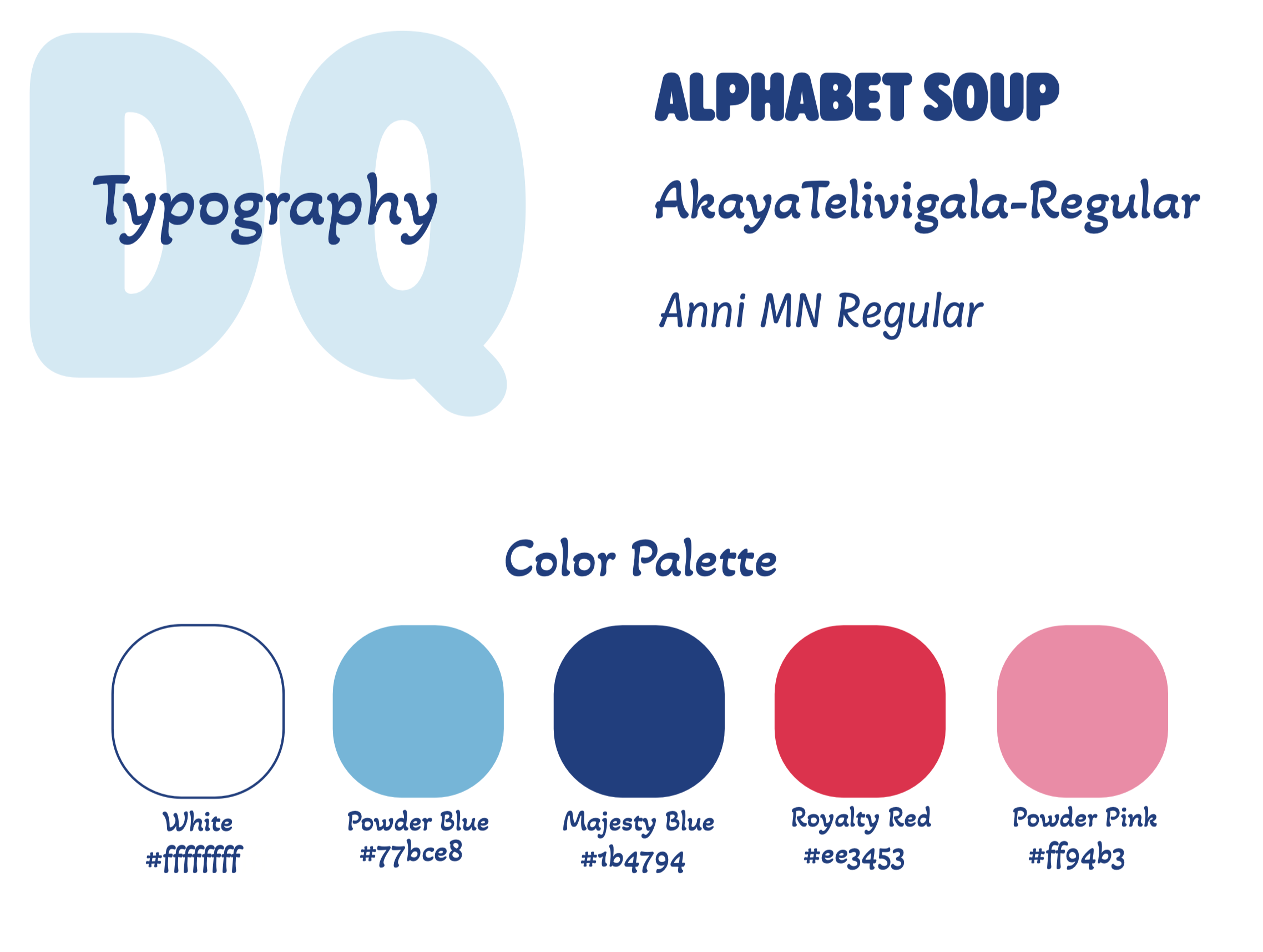
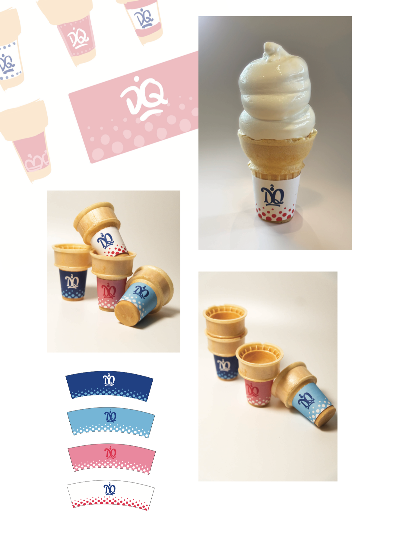
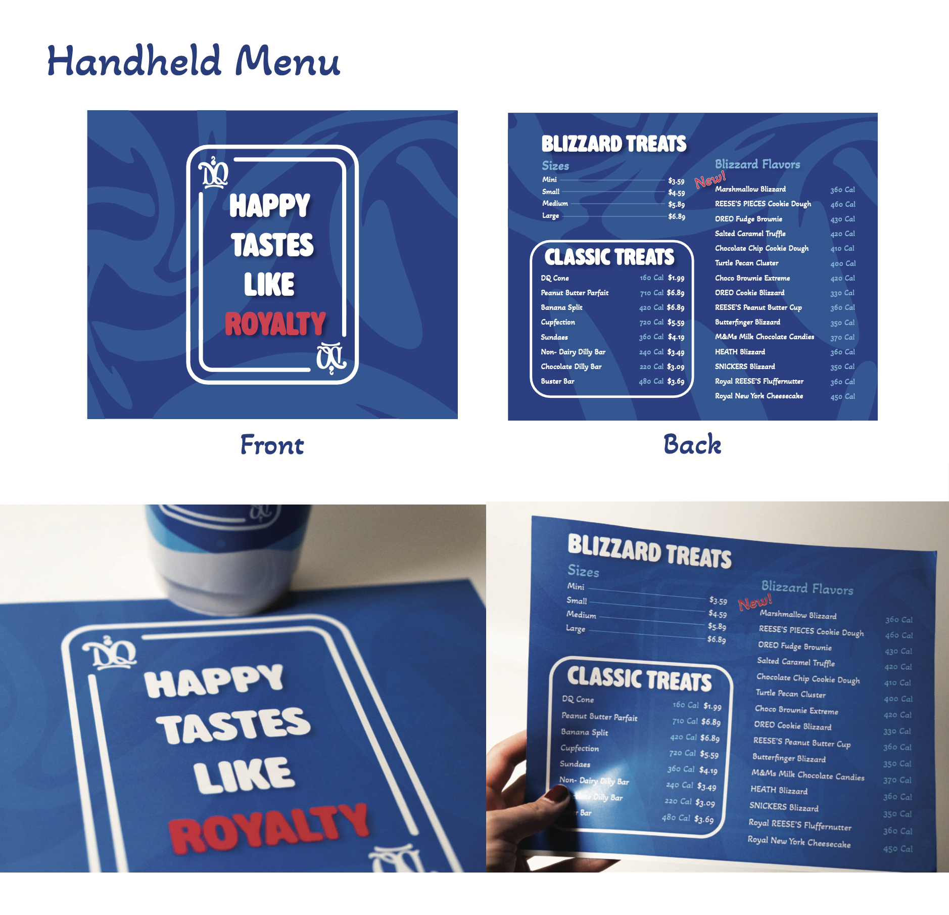
My final designs combine the bold colors of the original with new iconography. I leaned heavily into the “Queen” keyword of the brand, forming the logo design around the appearance of a queen’s crown.
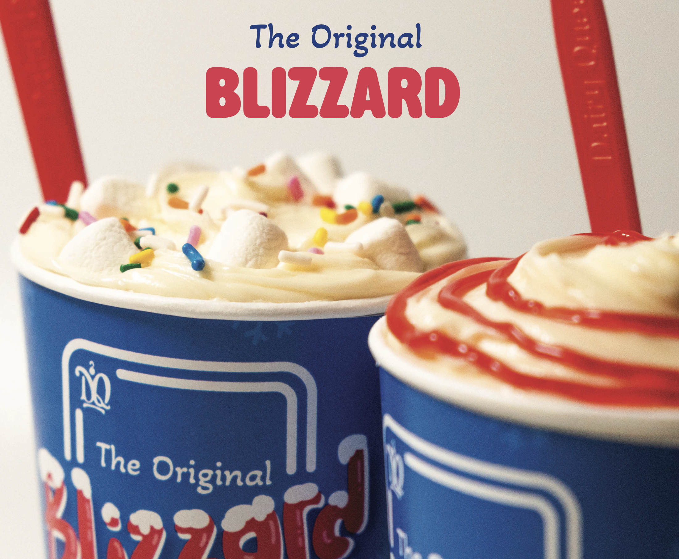
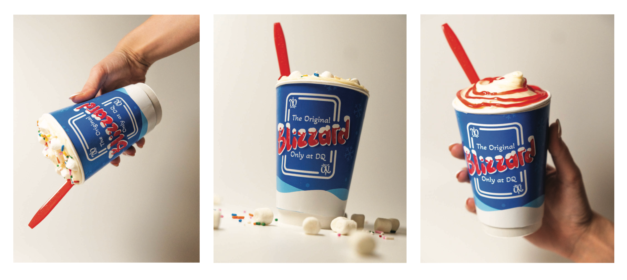
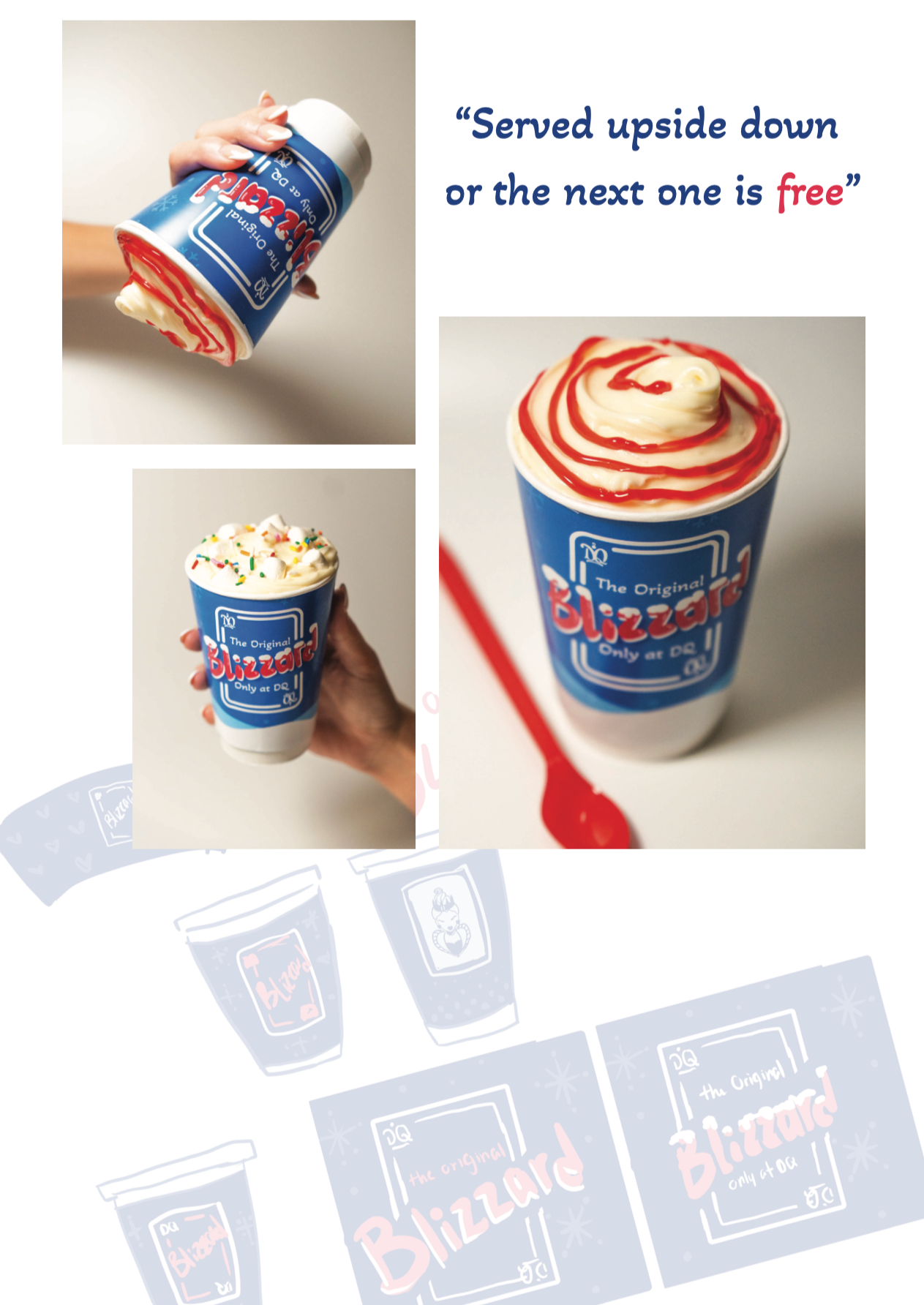
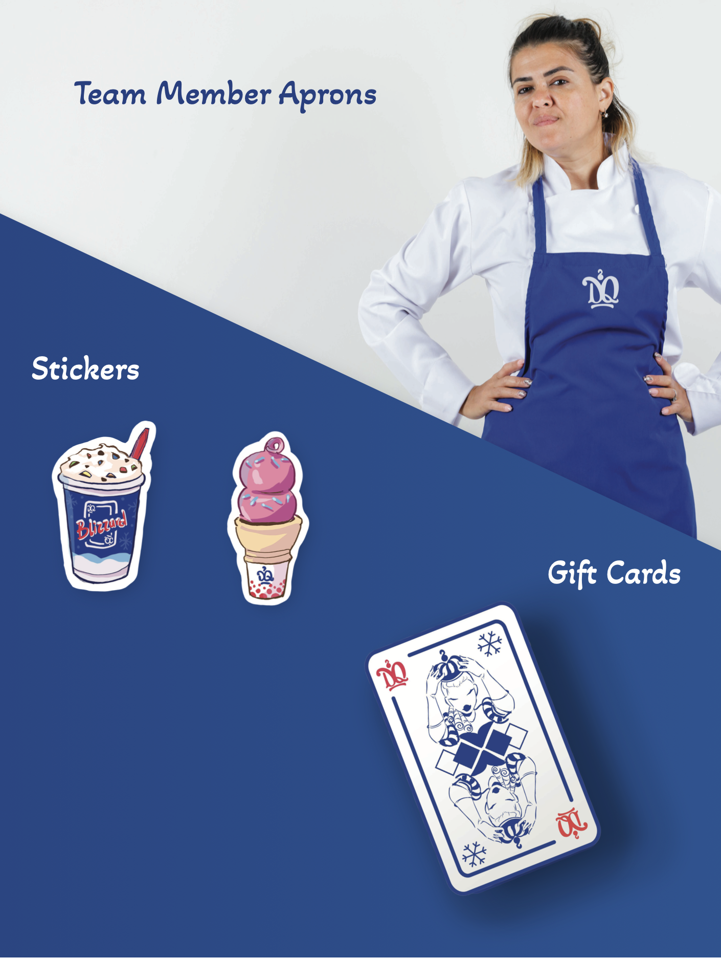
Iconic to the brand itself is “flipping the blizzard.” While this serves as a fun way to show how thick their ice cream is, it does not show up anywhere in their visual branding. I decided to lean into this by creating a playing card design for the blizzard. This is also a play on “The Queen of Hearts” found in a game of cards.